MCC Student Extranet Redesign
A research-driven redesign of the My Way student extranet, shaped by surveys with students, faculty, and staff.
Client
Metropolitan Community College
Services
UX Research, UX/UI Design
Industry
Higher Education
Year
2022

The Problem
Metropolitan Community College's student extranet had grown into a patchwork of aging pages. Canvas, Self Service, Office 365, and other campus tools each lived behind different links with inconsistent naming and no visual hierarchy, and the experience was even harder to navigate on a phone. Students struggled to find everyday essentials like schedules, events, and campus locations — and faculty and staff absorbed the wayfinding questions that resulted.
The Research
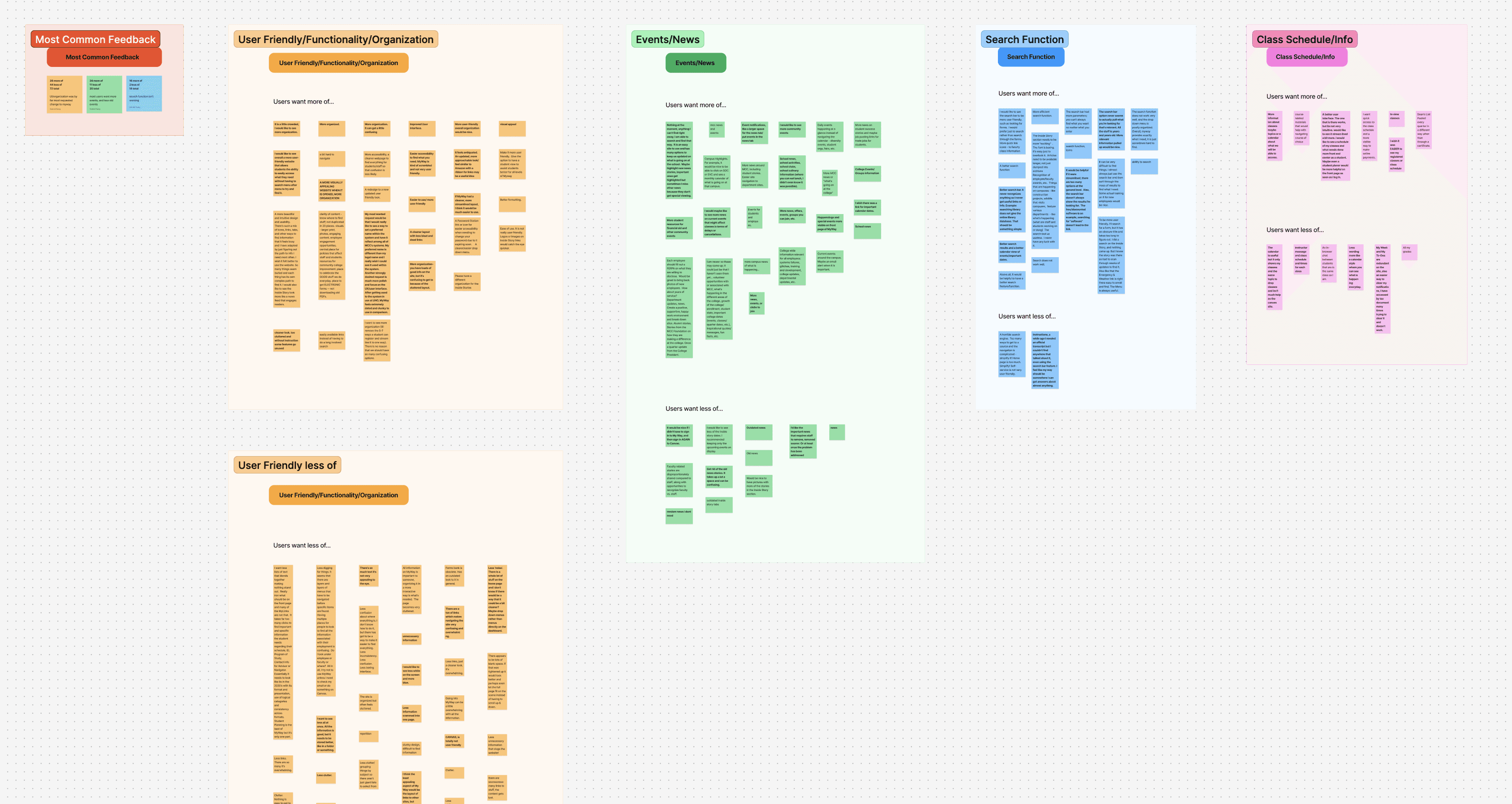
Instead of guessing at priorities, I surveyed the people who use the extranet every day. The My Way survey collected 75 responses from students, faculty, and staff, and I synthesized the open-ended feedback into an affinity map. Four themes dominated: overall organization and user-friendliness, campus events and news, the search function, and class schedule access. The signal was consistent — people weren't asking for new features. They wanted the existing ones organized, findable, and fast.
The Redesign
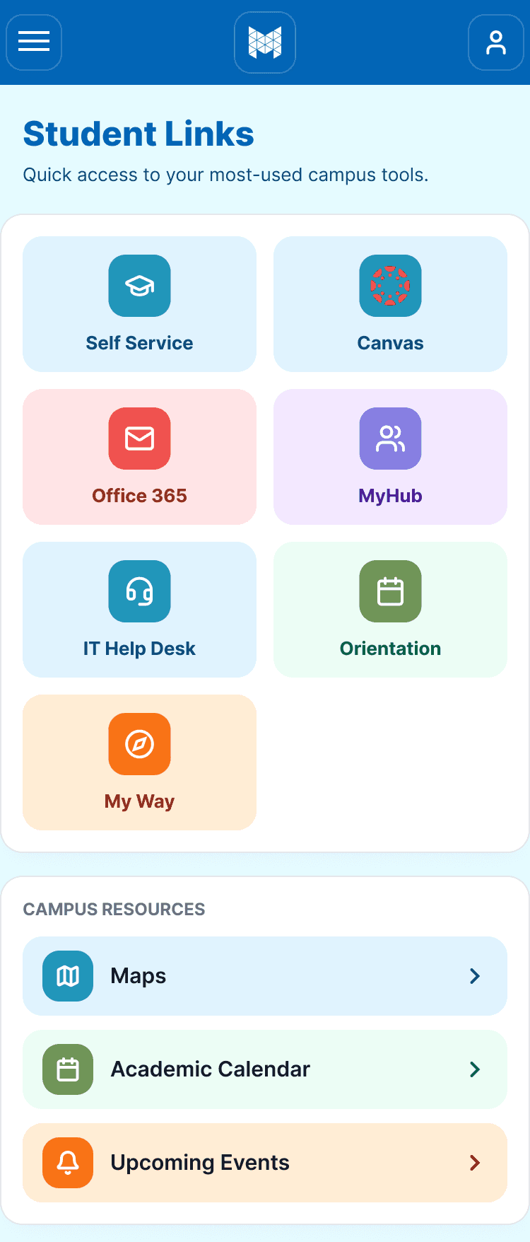
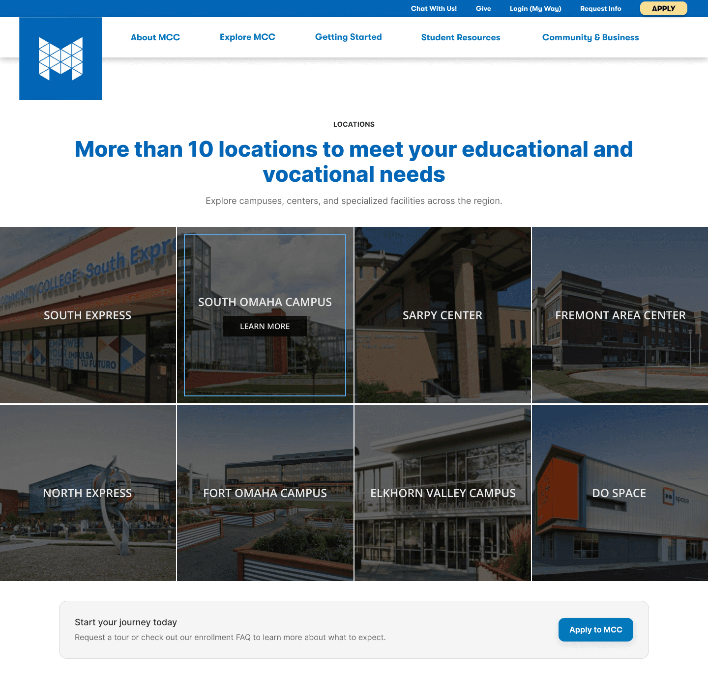
The redesign reorganizes the extranet around a card-based hub. Student Links surface the most-used tools as clearly labeled, color-coded tiles, campus resources — maps, the academic calendar, and events — sit in their own group directly below, and system alerts like planned maintenance appear inline instead of getting lost in email. The same structure adapts to mobile as a scannable grid. I also redesigned the locations page, replacing a text-heavy directory with a visual grid of campuses and centers and a clear path to apply or request a tour.